News & Announcements
Introducing A New Design System
Netlify is growing.
As our user base and team grows, it’s natural our product would as well.
Since I joined this brilliant team we have shipped amazing new features at a incredible pace, and we have an exciting roadmap planned for the future. However, this amazing pace means that sometimes our product’s current design showed its limitations — if we want new features and our product to scale graciously, we needed our UI to do the same.
Our goal was to facilitate and accommodate, rather than create friction.
Today we are rolling out the first of many iterations to our app‘s user interface.
What’s wrong with the current design?
The problem we are solving is not the overall ‘look’ but instead how flexible the User Interface can grow while welcoming big and transformative features.
It’s easy for designers to fall in love with the idea of a redesign. It’s romantic, the idea of being able to redesign your product from scratch, no restrictions no limitations, it’s a product designer’s platonic dream.
It can also be a very dangerous trap.
A complete redesign is a massive project that can take months (sometimes years). They take up crazy amounts of resources and if you’re not solving a real problem, you are really wasting time and money. The whole Netlify team was aware of these pitfalls, we carefully studied how we should do it, which problems were we solving, and when to do it. It was decided that now was the time.
What we came up with.
Creating a more simple organizational structure and hierarchy for our application was the first step, and reflecting that in our header and navigation was one of our top priorities.
Part of that new header is something that we are calling the 'Hero Card’.
Many of our users, after setting up their sites in Netlify, don’t really need to revisit the UI often. That’s one of the brilliant things about Netlify, you can set it, and forget it.
However, in the situation where you are going back to the UI, it’s ideal that for you to get in and get the job done as quickly possible.
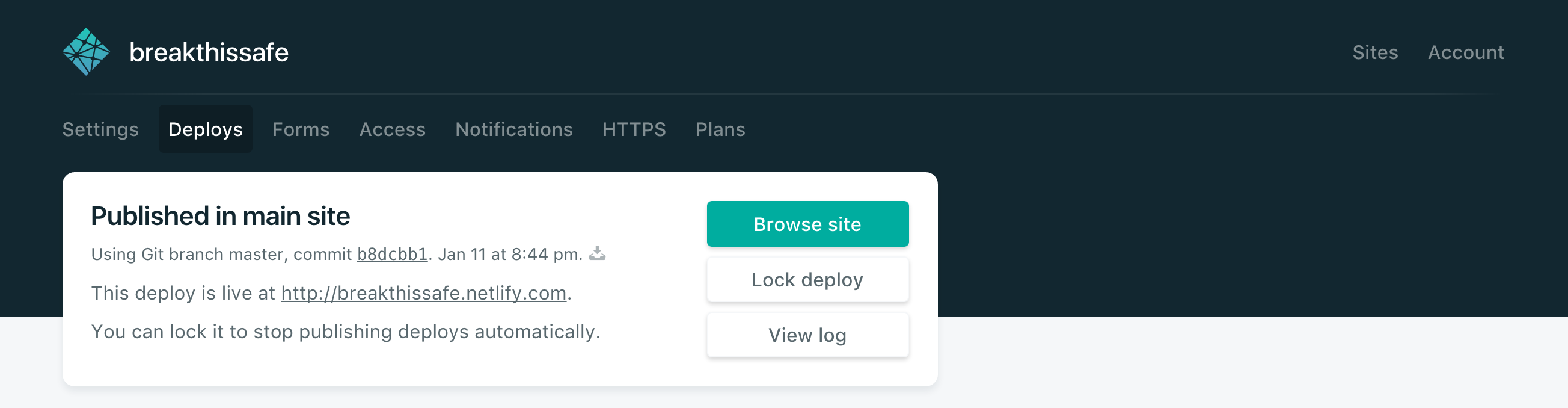
The Hero Card is the first element that you see in most pages. It allows you to see a quick summary of the page and gives access to the most common/pertinent actions and information.
I personally want to thank the whole Netlify team for being so supportive, smart as hell, and help get these mockups into a real product; Wilson Miner for being a scary well of wisdom and insight, I cannot stress enough how honored I am being able to count on your support.
And You, the Netlify user, for being the best, most passionate, smart group of people I’ve worked for.
This post has been featured on Netlify Milestones on the road to 1 Million Devs: